Product engineer at Knock in NYC. I build agent-first growth infrastructure that powers notifications for companies like Vercel, Zapier, Medium, and 300M+ people worldwide.
Ex-founder, obsessing over product and the future of agents. I love investing. I love my city.
I also love to connect with other builders and like-minded people. If this is you, shoot me a message. Let's build.
Writing
Recent work
- Agent-led growth with Claude + Knock Speaking at the Marketing Engineering Meetup in SoHo June 9 2026
.png)
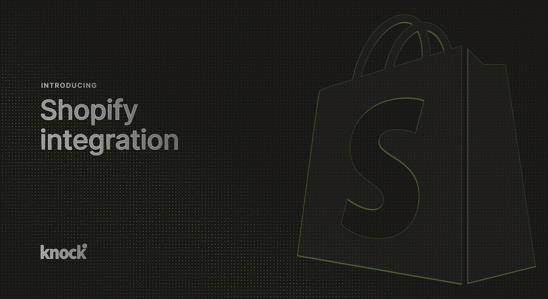
- Shopify data source Connect your Shopify store to Knock in a few clicks to power order and customer notifications from real-time commerce events.
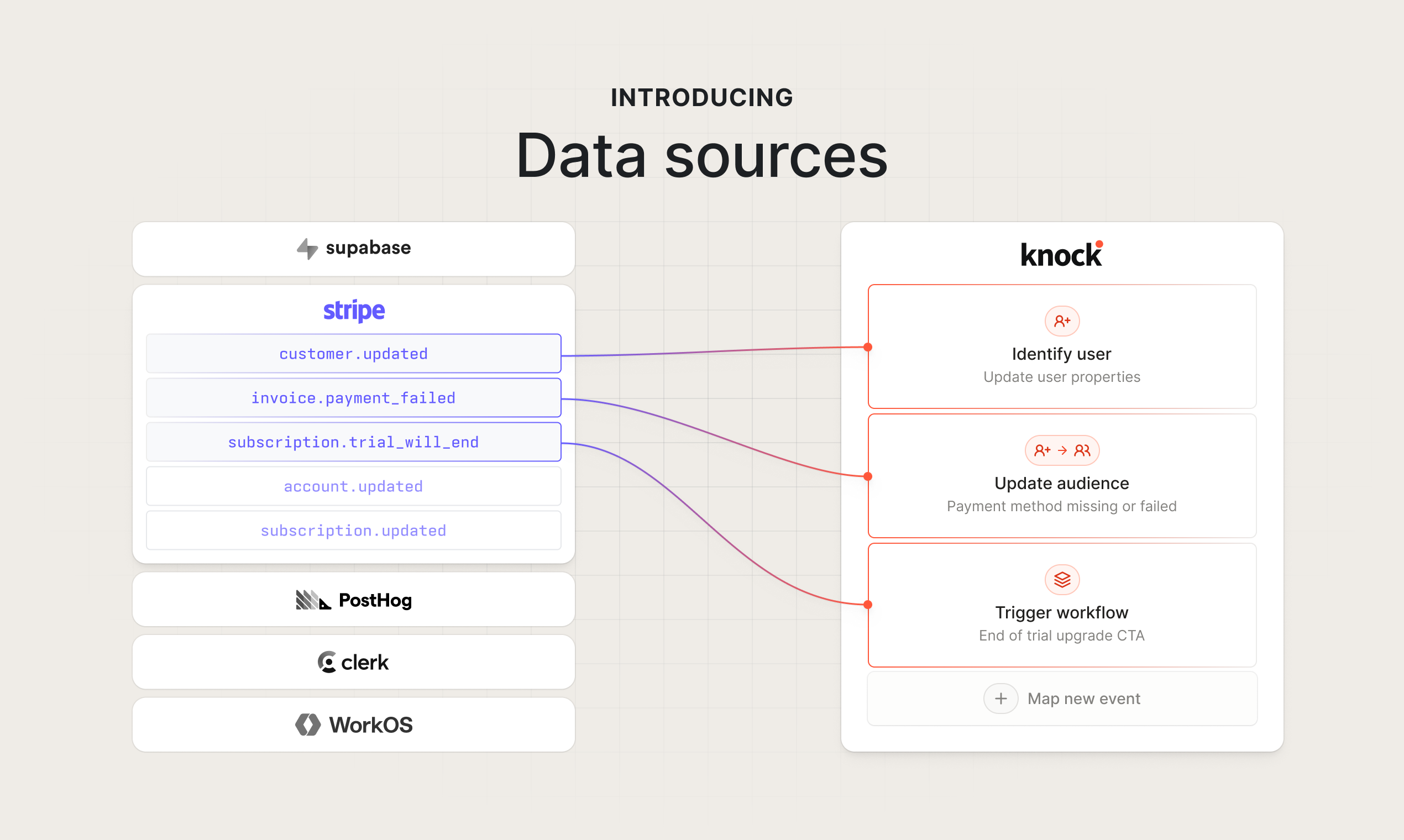
- Data sources Connect events from any service to your Knock messaging infrastructure in a few clicks, no code required.
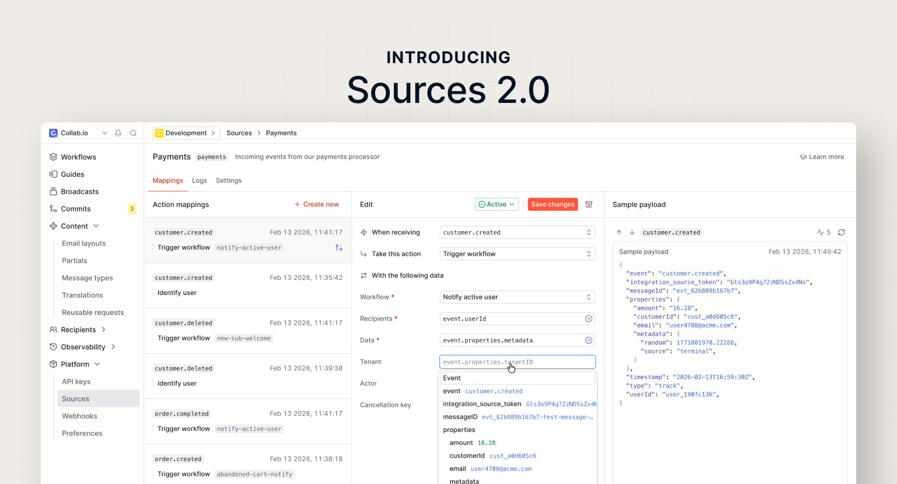
- Sources 2.0 A new design for ingesting events from third-party tools into Knock.